


 32 / 34

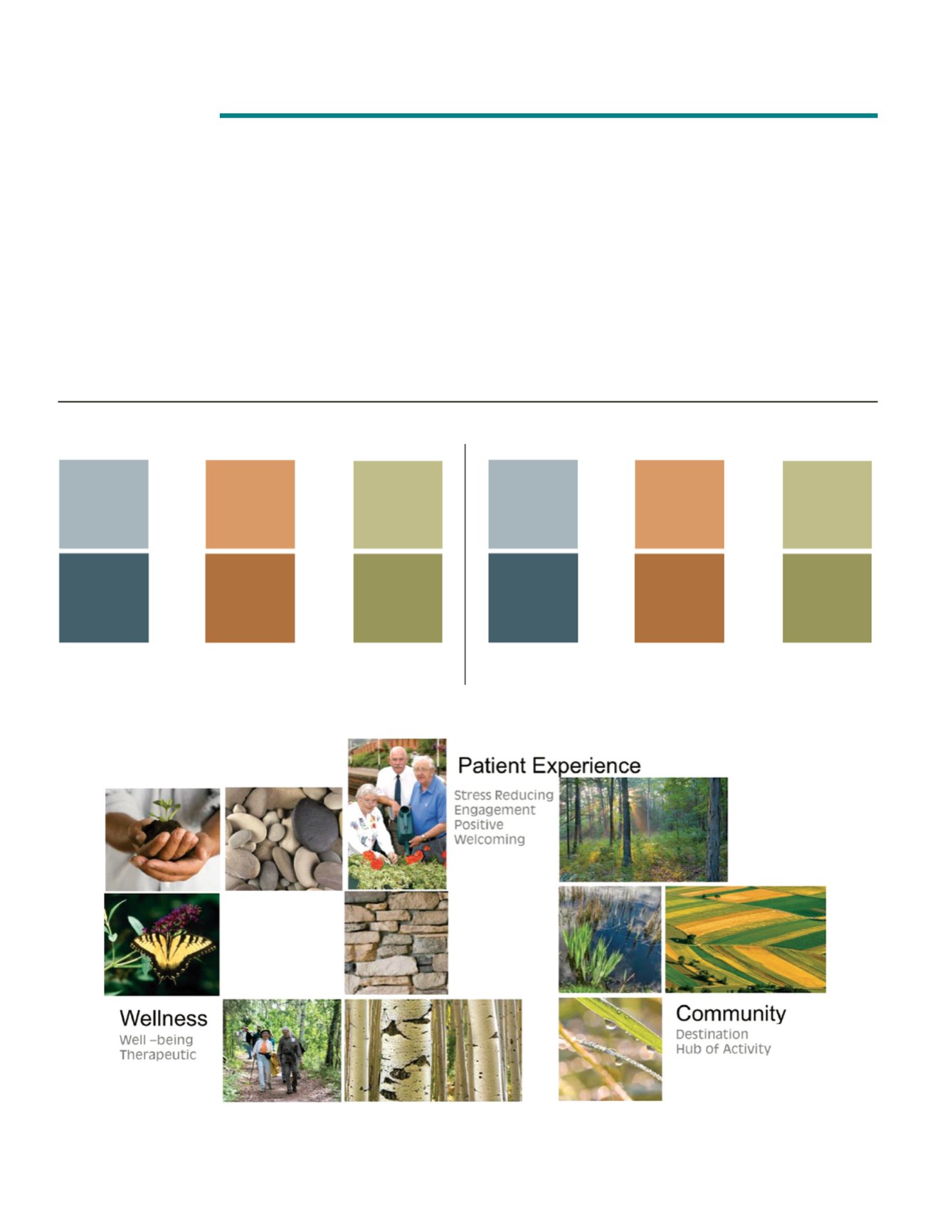
The paint palette for our new facilities was chosen
with care. Our objectives were to:
• To support our vision of creating an engaging
community beacon that enhances patient
experience and creates a destination of choice
• To provide a calming, stress reducing
environment by bringing “the outside in”
• To use colors as a means of way finding
Dual hues of natural colors were identified. The lighter
colors will be used as accents within department
spaces, and the complimenting darker hue will be
used at reception areas. Each department was
assigned one of the four select colors.
Centers of Excellence:
Visual Cues
BAY AREA MEDICAL CENTER PERFORMANCE IMPROVEMENT 2016 • PAGE 30
Level 1
HOSPITAL
BLUE
ORANGE
GREEN
IMAGING
INTENSIVE
EMERGENCY
CARE UNIT
DEPARTMENT
MOB
BLUE
ORANGE
GREEN
CANCER
GEN SURG
WOUND CARE
CENTER
OUTPATIENT
REGISTRATION
TESTING